Infographic : 10 Valentine’s Day Gifts for $25 or Under

The average annual Valentine’s Day spending in the United States exceeded $18 billion dollars last year, making it the second-highest grossing holiday next to Christmas.

Over 61% of American consumers celebrate the most romantic day of the year, spending an estimated $126 showering loved ones with gifts.

Remember when Valentine’s Day consisted of homemade cards and boxes of candy hearts? Neither can we.

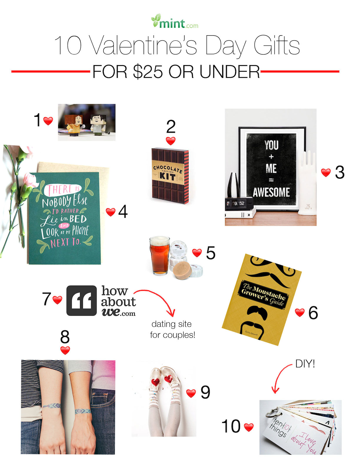
With cupid’s arrow hitting wallets hard, here are 10 Valentine’s Day gift ideas for $25 or under that are sure to make your sweetheart weak in the knees.

Infographic Source :- mint.com

Infographic : 10 Valentine’s Day Gifts for $25 or Under


Infographic : Ferry to France vs Plane

Here is an infographic from the popular United Kingdom ferry company called Brittany Ferries all about the benefits of travelling to France by ferry as opposed to plane. Some of the key benefits mentioned in the infographic are, when travelling to France by ferry you can take your own vehicle, when travelling to France by ferry you can take more luggage and when travelling to France by ferry the food is much better than it is on a plane.

Infographic Source :-  www.brittany-ferries.co.uk

Infographic : Ferry to France vs Plane


Infographic : 2014’s Kitchen Design Trends

While looking through today’s top home décor magazines, it’s easy to get lost in what’s feasible, and what’s practical. Thankfully, Part Select has created an infographic entitled “ 2014’s Kitchen Design Trends ”, detailing all the most popular looks in kitchens today.
Kitchens have really taken on a new role in today’s social sphere. Long done are the days of formal, separate dining areas. Kitchens are now the centerpiece of get-togethers, where people join together to socialize and mingle. To further that angle, designers are incorporating warm, inviting tones with cool, natural wall colors and textures.
Infographic : 2014’s Kitchen Design Trends

The Worst Places in the World

While cruise pamphlets and getaways to dream destinations may be in your plans for the next year, you may be surprised at how your next destination ranks when it comes to factors such as toxicity, cancer rates, water quality, sexual assaults, and murder. http://onlinemastersinpublichealth.com/ has created an interactive infographic entitled “The Worst Places in the World”, listing factors that may impact the quality of life, along with listing the countries from best to worst in those categories. These categories include factors like deaths, murder, GDP, water sources, and pollution.


Produced By Online Masters in Public Health


The Kids Aren’t Alright

Every country has its own traditions and celebrations when it comes to the birth of a child. In most societies, a child is a blessing to be celebrated.  Once the child is born, however, they enter into a world full of perils. http://www.healthcare-administration-degree.net has created an interactive infographic entitled “The Kids Aren’t Alright”, detailing the treatment of children across the globe, shedding light on factors like female mutilation, teenage suicide, and safety.


Produced By Healthcare Administration Degree Programs


The Criminal States of America

When you turn on the news, it’s no surprise to see reports of violent crimes or robberies. You may see these stories affect your daily life, by being more wary of your surroundings, taking self-defense classes, or even starting a neighborhood watch program. But do you know how your state ranks compared to others in crime rates? http://www.criminaljusticedegreehub.com/ has created an interactive infographic entitled “The Criminal States of America”, detailing each of the state’s crime rates, along with color coding the states from best to worst. Let’s take a look!

Produced By Criminal Justice Degree Hub


Big Data, Small Footprint?

While browsing the internet, many people want to know how we are supplied with what seems to be an endless supply of data. Where does all this energy come from? What’s the impact it has on the environment? Well, http://www.bestcomputerscienceschools.net/ has created an infographic entitled “Big Data, Small Footprint?”, explaining all the details of the where, when, and how’s of data, and its impact on the environment.

Big Data, Small Footprint?